June 30, 2011No Comments

Better Place 10 Words Minifestos

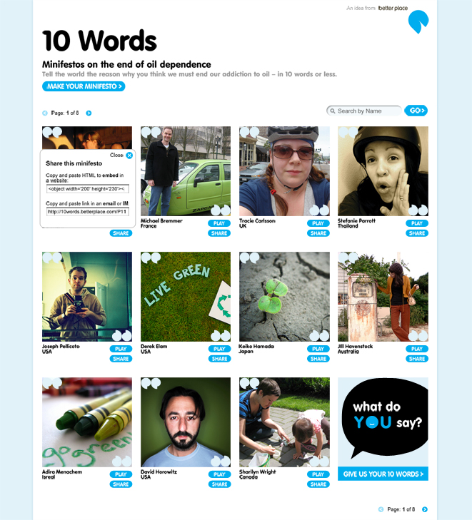
Better Place is a company that creates electric car infrastructures for communities and nations. They asked Odopod to create ways to energize the public around the electric car movement while secondarily introducing their name/brand to the world. Our concept, the 10 Word Minifesto, provides a way for individuals to express themselves simply and beautifully. Each person was asked to give us his/her ten words and we created a system that would animate them in thoughtful and compelling ways. The visual language was an extension of their branding system. As design lead on the project I was responsible for developing the visual language, site design, storyboards and Flash animations.

Horizon Interactive: Bronze

June 30, 2011No Comments

IDEO Eyes Open

Odopod collaborated with IDEO to create a site that would compliment a series of books that redefined the relationship of person to place typically found in most travel publications. Our team was very small and we worked very closely with one another from concept to launch. The idea for the site was to curate "experience stories" from invited guests and to give thematic assignments which allowed everyone the opportunity to share their own stories.

I led the visual design effort which involved not only taking the visual language from the books and extending it to the web, but concurrently create a sensible and compelling IA structure to hold all of the content. At the end of the IA/discovery phase I created a document that outlined our findings.

View this document »
View site »

June 30, 2011No Comments

Zune

Microsoft Zune asked Odopod to strategize how their site could enable music lovers to discover and share music. After an initial strategy/discovery period the designers were asked to apply visual languages to wireframes. As a senior designer I was responsible for creating one of the directions.

June 30, 2011No Comments

Nike Soccer

At Odopod I worked on the Nike Soccer account for two years, creating designs for site pages, emails, videos and wallpapers. Oftentimes I was given a library of assets from which to compose my designs, but was given lot of liberty to add elements of my own markmaking which made the design process expressive and fun.

June 1, 2008No Comments

CLIF Bar

Over the course of a long collaboration, CLIF Bar and Odopod created a site that truly reflected the spirit and brand of CLIF Bar's products and community. As design lead I was responsible for setting the visual language of the site, producing a library of assets for other designers to use, creating many unique page designs and leading the team of designers and developers during implemention.

Pixel Awards Nominee

February 1, 2006No Comments

Target Back To School

One of my first projects at Odopod was to design the site for the annual "Back to College" campaign on Target's website. Taking cues from the campaign's branding, I extended the visual language into pages that created fun ways for college students and parents to explore and purchase products.

January 5, 2006No Comments

Stephen Malkmus

I was asked to redesign the website for Stephen Malkmus. I wrapped everything into a one-page design and skinned it to more or less match the latest album release. We are currently working on another redesign, set for launch this summer. Visit »

May 1, 2002No Comments

Learning To Love You More

Started in 2002, Learning to Love You More is a web site comprised of work made by the general public in response to assignments given by artists Miranda July and Harrell Fletcher. I worked with Miranda and Harrell to create a site that had a unique visual language (slightly disarming for the time) and was flexible enough to hold many different types of content. The project ended in 2009 and over 8,000 submissions were published. In 2010 it was acquired by the San Francisco Museum of Modern Art. Visit »

2004 Whitney Biennial

June 1, 2000No Comments

Harrell Fletcher

One of my first web design projects was redesigning the website for the artist Harrell Fletcher. We decided that the design needed to be very clean and simple, a design that allowed the user to easily navigate between the various projects. We launched this site over eight years ago and it's still serving its purpose. Visit »